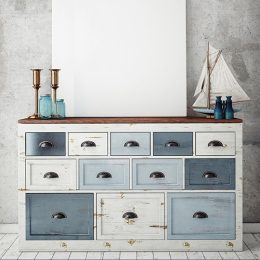
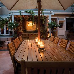
“Direct rejects traditions and restrictions within the interior space and creates new boundaries and divisions with an exciting use of colour blocking. An expressive and energizing collection of colours selected to revitalize the home.”
Jemma Saunders, Crown Colour Specialist
Direct is an ode to Lee Krasner, the female artist who became a pioneer in abstract expressionism. As the wife of Jackson Pollock, her work was overshadowed until later in life when she truly discovered her form. As a woman and an artist, she captures the spirit of originality.
Direct is similarly expressive and non-conformist.
There are no conventional colours, each appears to have passed through a digital chromer. Its placement leads the eye and doesn’t conform to certain spaces; breaking free from architectural constraints. Above all, it is fun.
“This trend is all about self-expression through grown up colour. Energetic and full of life, Direct is non-conforming. The photography breaks away from tradition with architecture emphasized in contrasting colours. Conveyed through a palette of upbeat but sophisticated colours, cool shades dominate whilst complementary hues are shown in the furnishings and furniture and add vitality.”
-Kathryn Lloyd, Crown Colour Specialist
COLOUR PALETTE

The palette is bright and unexpected, combining sky blue with bold plum and vivid cobalt with mint green.
The colours are grown up in their compilation and aim to make a space a little less austere, and a little bit happier.
“The Direct palette gives a new perspective on how we look at and use tone and hue. Here are colours that when combined together are energetic, uplifting and heartfelt. Differing weights of colour create a dynamism and tension, whether connecting one room to another or adding a block of contrast across natural architectural boundaries. This is an exciting way of working within a space to add interest and definition: this approach to colour obeys no rules – it is all about expression and having fun.”
-Judy Smith, Crown Colour Consultant
“Direct’s colour palette is very dynamic. Bright, bold colours like cobalt blue and vibrant teal are pared for balance with pale powder blue, soft mint and delicate pink. It invites creativity and experimenting with unusual colour combinations. Electrifying cobalt is vital in this colour palette.”
-Justyna Korczynska, Crown Design Studio


