Immerse yourself in the big blue.
Reset offers a chance to wind down, feel the warmth of the sun, absorb the scents of jasmine and lemon and drift with the ebb and flow of lapping water.
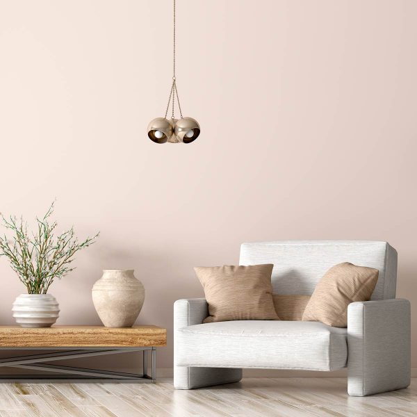
The different blues drift from one to the next in this watercolour palette, which helps create a positive effect on our wellbeing. Warm ochres, sandy hues and hessian textures restore equilibrium with organic naturalness.
“This trend is evocative of the most breathtaking view in the most memorable of destinations. Feel the warm glow of the sun against the cool flow of the sea. The blues drift from one to the next in this watercolour palette which helps towards a positive effect on our wellbeing.”
– Lisa Miller, Senior Graphic Designer
“Warm and earthy neutrals work in harmony with relaxing blues in Reset, our trend inspired by escapism and simple things. Reset encourages people to be mindful and live in the moment, with its soft and quiet colour palette that evokes the calming and serene feeling that the ocean brings.”
– Neville Knott, Crown Colour Consultant

“The Reset colour combination with its cool blues and warm sandy nuances is the perfect harmony of opposites. The colours remind us of a fresh breeze, cool water as well as warm sand and the evening sun on our skin – just relaxation for the senses.”
– Mareike Necke, Colour Consultant for ELLE DECORATION by Crown Germany
“Soft, mindful colour palette with Prussian blue to accent. This is the new Mediterranean with a colour palette of earthy, sandy neutrals and ethereal blues to echo the natural landscape of the sand and sky.”
– Kathryn Lloyd, Crown Colour Specialist